
I have made my share of forgettable church bulletins. The kind that get folded into a coat pocket, fished out three weeks later, and tossed. Somewhere along the way I stopped treating the bulletin as a chore to finish by Saturday night and started treating it as one of the most consistent touchpoints my church has with its people. If you are hunting for church bulletin ideas that move beyond the order of service and a few announcements, this guide pulls together what I have learned about content, design, format, and engagement, with practical steps you can use this week.
- Why Church Bulletins Matter
- Creative Content Ideas for Your Church Bulletin
- Design Tips to Make Your Bulletin Stand Out
- Digital vs. Printed Bulletins: Choosing the Right Format
- Engagement Strategies for Your Bulletins
- Real-Life Examples of Successful Church Bulletins
-
Frequently Asked Questions
- What should be included in a church bulletin?
- How can I make my church bulletin more engaging?
- What are some creative themes for church bulletins?
- Should my bulletin be digital or printed?
- How often should a church bulletin be updated?
- Can I use templates for my church bulletin?
- What software is best for designing church bulletins?
Why Church Bulletins Matter
A bulletin is rarely anyone’s favorite ministry project, yet it lands in more hands on a Sunday than almost anything else you produce. That reach is exactly why it deserves real attention. When I started measuring how people actually used ours, I realized it was shaping first impressions, driving event attendance, and quietly telling visitors whether we had our act together.
The numbers back up the instinct. According to a survey shared by Church Marketing Sucks, a large majority of congregations believe a well-prepared bulletin improves participation in church activities. Other industry figures suggest churches that update their bulletins consistently see meaningfully higher member retention, which tells me this is not a throwaway document. It is a communication tool that earns or loses trust every week.
I think often of a warning from one church communications expert that reframed how I write every announcement.
“Churches are making the dangerous assumption that if it’s important to us, it must be important to the audience.” – Phil Bowdle, Author and Church Communications Expert
The History of Church Bulletins
The church bulletin is older than most people assume. Printed orders of worship became common as affordable printing spread through congregations in the early twentieth century, giving members a way to follow the service and carry information home. For decades the format barely changed. A folded sheet, a hymn list, a few notices, and a sermon outline. What has changed is the expectation around it. People who scroll polished feeds all week notice when their church hands them something cluttered or dated, and that contrast is part of why thoughtful design now matters more than it used to.
What Makes a Church Bulletin Effective
An effective bulletin does three things well. It informs without overwhelming, it reflects the character of the church, and it invites a response. I keep a short test in mind. If a first-time visitor could read our bulletin and know what is happening, who to talk to, and what to do next, it is working. If it reads like an internal memo full of acronyms and inside references, it is not. Clarity beats cleverness, and white space is not wasted space.
Creative Content Ideas for Your Church Bulletin
Once the basics are solid, content is where a bulletin comes alive. The order of service, scripture readings, and community announcements form the backbone, but the pieces people actually remember are the human ones. Industry data suggests bulletins that feature member stories can lift community engagement noticeably, and that matches what I have seen firsthand.
Here are content ideas I rotate through to keep ours from going stale:
- Member spotlights that introduce a different person or family each week
- A short testimony tied to the season or sermon theme
- A weekly prayer request section with clear instructions for submitting needs
- A relevant quote or short poem that echoes the message
- A “next steps” box that points newcomers to one specific action
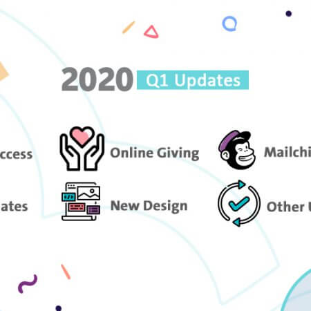
Seasonal themes give the whole bulletin a thread to follow. I lean into gratitude in November and Advent reflections in December, and I let the color palette and imagery shift with it.
Incorporating Visual Elements
Walls of text lose people fast. I break up our bulletin with simple visuals such as a photo from last week’s service, an icon next to each ministry area, or a clean banner for the sermon series. Real photos of real members do more work than stock imagery ever will, because people look for themselves and their friends. Even one well-chosen image per page changes how approachable the document feels.
Using Interactive Content
Interactive elements turn a passive handout into something people engage with. I have had good results adding a short reflection question for families to discuss over lunch, a fill-in-the-blank sermon outline, and the occasional light quiz tied to the season. In our digital version, a quick poll or a tappable link makes participation effortless. The goal is not gimmickry. It is giving people a reason to hold onto the bulletin past the closing song.
Design Tips to Make Your Bulletin Stand Out
Good design is mostly restraint. I am not a trained graphic designer, and I have learned that the cleanest layouts usually come from removing elements rather than adding them. A consistent grid, generous margins, and a clear hierarchy of headings do more than any flashy graphic.
Branding consistency matters more than people expect. When your bulletin, your signage, and your slides all share the same fonts and colors, the church feels organized and unified. I picked two brand colors and two fonts and have refused to drift from them, and the payoff is a look people now recognize as ours.
Choosing the Right Fonts
Fonts carry tone. I pair one readable serif or sans-serif for body text with a slightly more expressive font for headings, and I stop there. Two font families is plenty. Anything more starts to look like a ransom note. For body copy I keep the size at a comfortable reading point, because a meaningful share of any congregation has aging eyes, and a bulletin no one can read fails before it starts.
Balancing Text and Images
The balance between text and imagery is where many bulletins go wrong in one of two directions. Too much text and it feels like a tax form. Too many graphics and the information drowns. I aim for a rhythm where each section has room to breathe, with images supporting the message rather than competing with it. A simple ratio I follow is to let visuals occupy roughly a third of any page and reserve the rest for content and white space.
Digital vs. Printed Bulletins: Choosing the Right Format
This is the question I get asked most, and the honest answer is that it depends on your people. One industry estimate suggests a majority of churches have moved at least part of their communications online, but that does not mean print is dead. Many congregations are best served by a hybrid approach that respects both the member who lives on her phone and the one who wants paper in hand.
Here is the comparison I walk leaders through when they are weighing the two.
| Factor | Digital bulletin | Printed bulletin |
|---|---|---|
| Cost | Low ongoing cost, no printing | Recurring paper and ink expense |
| Accessibility | Easy to enlarge, share, and translate | Familiar, no device or signal needed |
| Engagement | Trackable clicks and live links | Tangible, stays in the home |
| Updates | Editable up to the last minute | Fixed once printed |
| Reach | Shareable beyond the building | Limited to who is present |
Best Practices for Digital Bulletins
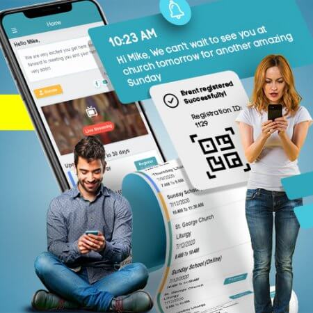
For digital bulletins, I keep the experience friction-free. That means a mobile-first layout, tappable links to giving and event sign-ups, and a stable web address that never changes. QR codes have been the single best bridge between print and digital for us. We place one on the printed bulletin so anyone can scan it and pull up the full digital version with live links. Generating one is simple, and you can embed it with a short snippet like this:
<img src="https://api.qrserver.com/v1/create-qr-code/?size=150x150&data=https://yourchurch.org/bulletin"
     alt="Scan for this week's digital bulletin" />
Transitioning from Print to Digital
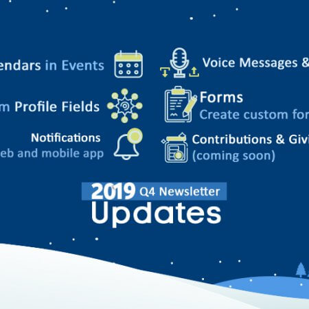
Moving from print to digital works best as a gradual shift, not a hard cutoff. I introduced the digital version alongside print for several months, taught people to scan the QR code, and only trimmed our print run once I saw real adoption. Communicate the why, keep some printed copies for those who need them, and resist the urge to flip the switch overnight. A tool like ChMeetings can hold your events, groups, and member communication in one place, which makes the digital side of this transition far less manual. Try ChMeetings Today if your announcements currently live in five disconnected spreadsheets.
Engagement Strategies for Your Bulletins
A bulletin should be a conversation, not a broadcast. The churches that get the most out of theirs treat it as a two-way channel, inviting members to respond, contribute, and share.
Creating a Feedback Loop
I learned more from one simple feedback question than from years of guessing. We added a short line inviting people to tell us what they wanted to see, with a QR code linking to a thirty-second survey. The responses reshaped our content. Even better, I started inviting members to create pieces of the bulletin themselves, whether a recipe, a book recommendation, or a testimony. Member-created content and peer feedback give people ownership, and ownership drives readership. Run a brief survey once a quarter and actually act on what comes back.
Encouraging Social Media Interaction
The bulletin and your social channels should feed each other. I include our handles and a single clear call to follow, and I tease content that lives online, such as the full sermon video or photos from a recent event. When members share that content, your reach extends well past the people in the room on Sunday. Keep the ask specific. One platform, one action, one reason to tap.
Real-Life Examples of Successful Church Bulletins
Nothing teaches faster than seeing what works elsewhere. The two examples below reflect approaches I have watched churches use to real effect, and both are worth borrowing from.
Case Study: Two Rivers Church
Churches like Two Rivers Church show what happens when a bulletin is treated as a design asset rather than an afterthought. A consistent sermon-series brand carries across the bulletin, the screens, and the social feed, so everything feels like one coherent voice. The print version stays lean, pointing to a richer digital companion through a QR code, and a recurring member spotlight keeps the content personal week to week. The lesson I take from this approach is that consistency and a clear next step matter more than packing every inch with information.
Case Study: Harvest Christian Fellowship
A fellowship like Harvest Christian Fellowship illustrates the engagement side of the equation. Their strength is the feedback loop, with simple prompts inviting members to submit prayer requests, testimonies, and even content ideas directly. That participatory model turns readers into contributors and keeps the bulletin feeling like it belongs to the whole congregation rather than the office staff. If you want a community that reads the bulletin, this is the model to study. Build in ways for people to put themselves into it.
For ready-made starting points, Template Lab offers free bulletin layouts, and Canva’s church templates make it easy to produce a polished design without specialized software.
Frequently Asked Questions
What should be included in a church bulletin?
At minimum, include the order of service, scripture readings, announcements, and community news such as prayer requests and upcoming events. From there, add the human touches that build connection, like a member spotlight, a sermon-related quote, and a clear next step for visitors. Always include contact details and a way to give.
How can I make my church bulletin more engaging?
Add interactive elements such as a reflection question, a fill-in-the-blank sermon outline, or a short quiz. Use real photos of your members, feature their stories, and include a QR code linking to richer digital content. Engagement comes from giving people something to do with the bulletin, not just read.
What are some creative themes for church bulletins?
Tie themes to the season or current sermon series. Gratitude works well in November, Advent reflections suit December, and renewal themes fit the new year. Match your colors, imagery, and symbols to the theme so the design reinforces the message rather than competing with it.
Should my bulletin be digital or printed?
It depends on your congregation. Digital bulletins cost less, update instantly, and reach people beyond the building, while printed ones serve members who prefer paper and need no device. A hybrid approach, with a printed version and a QR code linking to the digital edition, usually satisfies both groups.
How often should a church bulletin be updated?
Most churches update weekly to keep announcements and events current. A monthly format can work if your church prefers a summary-style publication, but anything less frequent risks stale information. Whatever cadence you choose, keep it consistent so members know when to expect it.
Can I use templates for my church bulletin?
Yes, and I recommend it. Customizable templates save hours and give you a professional starting point you can adapt to your branding. Reputable template libraries and design tools offer layouts built specifically for church bulletins, so there is no need to design from a blank page.
What software is best for designing church bulletins?
For most churches, Canva or Microsoft Publisher are the easiest entry points, with drag-and-drop templates and no learning curve. If you need advanced control over complex layouts, Adobe InDesign is the professional standard. Pair whichever tool you choose with a consistent set of fonts and brand colors.
The bulletin you hand out this Sunday will outlast the service in someone’s bag, on a fridge, or open on a phone screen. Treat it like the steady, weekly invitation it is, start with one or two changes from this list, and let your bulletin become something people actually want to read.